Promoting a product without knowing who your target audience is — or what they want — is an impossible task. You will just be making decisions based on what you think they want. That is not sustainable over the life of any brand.
That’s why creating user personas is important for any company that wants to grow. The research involved in putting together a user persona report will not only help you understand your target audience, it will also help you create a better product for them.
Things like life goals, education level, age, and common problems will determine how you serve these customers in the future — especially when it comes to making marketing decisions. Even small factors like location or salary can influence how those people make decisions, and in turn use your product.
User personas are important for creating a targeted marketing plan, and for influencing your growth strategy.
Not sure where to start? Here are 20+ user persona examples, tips, and templates to help you create some amazing user persona examples from scratch:
1. Create 3 to 5 unique and detailed personas to start.
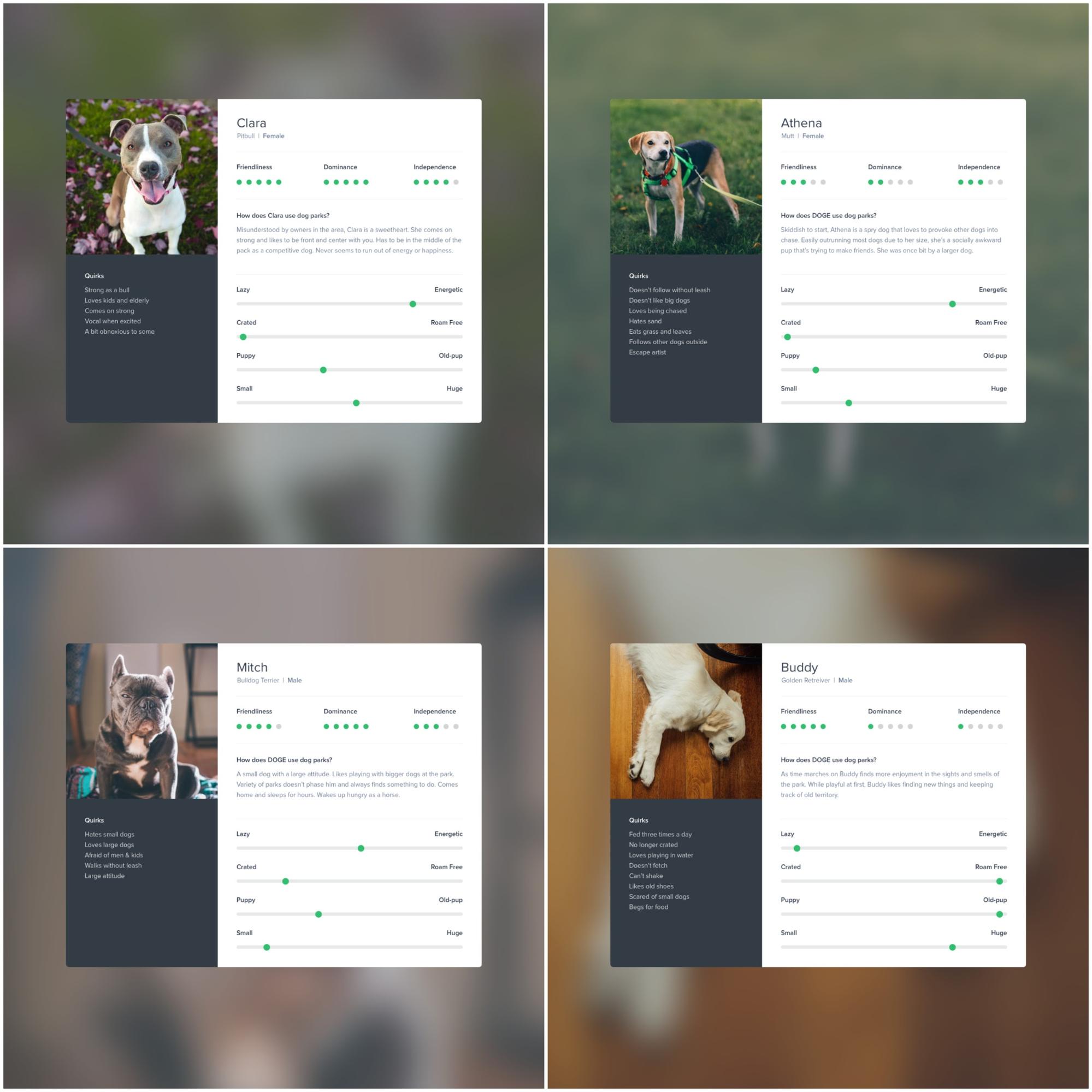
If you are creating your first customer or user persona guides, I would design one for each of your main customer groups. Most resources recommend between three and five distinct personas, and I am inclined to agree.
For example, Michael Szczepanski created four unique user persona examples below, they just happen to be dogs. I believe that this is the perfect range to make sure you cover all your bases and gain insight, without getting too in-depth.
2. Highlight products your audience already uses in your industry.
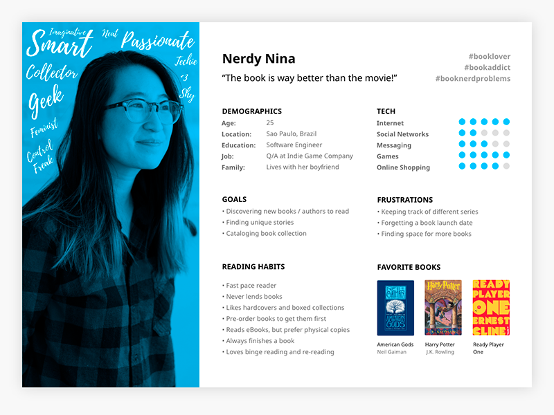
Including well-known products in a user persona guide is a simple way to add a wealth of secondary information. For example, if this user only buys Apple products and only shops at Whole Foods, you can make a lot of assumptions rather quickly.
Or like in this persona guide example for a reading app, the books that they love can help shape that persona. I mean, a user that reads romance novels at home is going to have different needs than one that reads only comics on the go.
3. Use a customer journey map template to help create each persona.
If you are having some trouble putting together your user personas, a customer journey map may help. This is a great way for you to look at the customer’s journey from a different angle, and hopefully come out the other side with better insight.
Just like in the below example, you can learn a lot about your personas by just studying how they use your product.
4. Use icons to emphasize information in your persona guides.
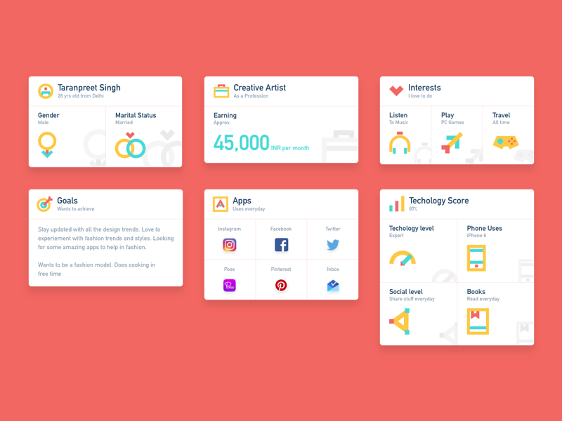
I am a huge fan of icons and illustrations, especially on infographics. These little visual helpers allow you to add context and information rather effectively. Plus, people are relatively familiar with icons, so there is no learning curve.
Because of that, they can also be used on a persona guide to illustrate a complex concept or idea. Just take a look at the below example, there are a plethora of useful icons. From the music icons in the interest section to the ones that help illustrate and organize the whole guide.
5. Find a common metric to track across your different personas.
When it comes to analyzing your different user personas, you should try to have at least one similar metric between them. Otherwise, you are going to compare really abstract things like their bio, keywords, or some other written metric.
Something like a score or point can generally be compared across the board. Then, you can use icons like stars to visualize these metrics, like in this user persona example from ABWS Digital.

6. Keep layouts consistent between persona guides.
Other than creating one of the most unique persona examples in this collection, this example from Shopify does something exceptionally well — almost as well as they know e-commerce, entrepreneurship, and inventory management. The designers kept the layout consistent throughout each card.
Consistency is key when creating an effective user persona because it allows for quick comparisons. It is not efficient to have people aimlessly searching for information because the designer wanted to switch things up.

7. Visualize persona data in a memorable way.
Providing real stats and metrics are a fantastic way to take your persona guide to the next level. But make sure that the data you are presenting is actually useful and memorable.
You can achieve this by creating data visualizations like we see in the example below. By combining icons with important data, the designers were able to create a visual that can be easily recalled.
If you do not have much (or any) experience creating data visualizations, starting with a user persona guide template can help.

8. Highlight the differences between your personas.
Different people have different goals, problems, and preferences. To help keep your marketing campaigns segmented and your product features focused, it can be helpful to highlight the differences between your personas.
Take a look at how this user persona example uses pie charts and custom illustrations to show the differences between each type of person:
9. Turn your user persona guide into an infographic.
Infographics are an outstanding way to communicate visually. So, why not turn your persona guide into an infographic?
The designers at LOLSMG used visuals like icons, decorative fonts, and conceptual images to make their user persona guide more engaging. Plus, there are already a ton of free infographic templates that you can use as a starting point.

10. Make sure the designs reflect the personas.
To make your user persona guides more memorable, use design elements that reflect each individual persona. Think about how you can use design to reflect their age, jobs, and interests. For example, if one of your personas is a 20-something in the tech industry, use bold, quirky fonts or colors in their persona guide.
Take a look at this gamer user persona, and how the design reflects his interests and problems.

11. Thoroughly research your users’ motivations and pain points, then highlight them.
When you start the actual research into specific personas it is important to look at both the motivations and pain points of each. A few guides that I saw while collecting user persona examples focused on only one or the other.
To truly create an accurate user persona, you need to thoroughly research both your users’ motivations and pain points.
For example, this highly qualified influencer finds it difficult to attend events (maybe because he’s a cat), and maybe your product can really help them out.

12. Include goals that your product or service may not directly impact.
Obviously, the goals that your product or service directly impacts should be featured in user persona examples. But you should also take it a step further and highlight the other goals this persona may have.
Maybe your product is a fitness app — like in the example below, which features traditional and nontraditional health goals. Now, these indirect goals may not be something your product will influence or impact, but they are still important in understanding the persona.

13. Begin your user persona guide with a helpful introduction paragraph
Part of creating a well-rounded user persona is giving them a backstory. It really does not have to be much, but enough to help highlight key traits or aspects. You can use this intro to talk about what makes your personas tick. Outline why your company should care about this persona. Or make it purely biographical, like in the user persona example above.
I like this approach because you can use it to tell a real story instead of just listing facts and figures.

14. Design a fully visual persona.
There are no rules that say your user persona has to be a document, a poster, or even an infographic. Honestly, it can be whatever helps your brand build better experiences for your users.
If you can create one that does not fit into any of the traditional conventions, like Jason Travis did below, then more power to you. I mean, with just a handful of items, he was able to paint a rich tapestry for each user.

15. Include details like geographic location and salary range.
Factors like location and salary are extremely useful, especially if your customer base is mostly in one geographic region. This user persona example from GB Lee made sure to feature both, but some guides omitted it completely.
Think about how different customers living in LA and NYC are, or how different the rent is when living in San Francisco and Kansas City.
Those are massive things that you cannot afford to ignore, or your user persona guide will be a wasted effort.
16. Use sliding scales to accurately define a user.
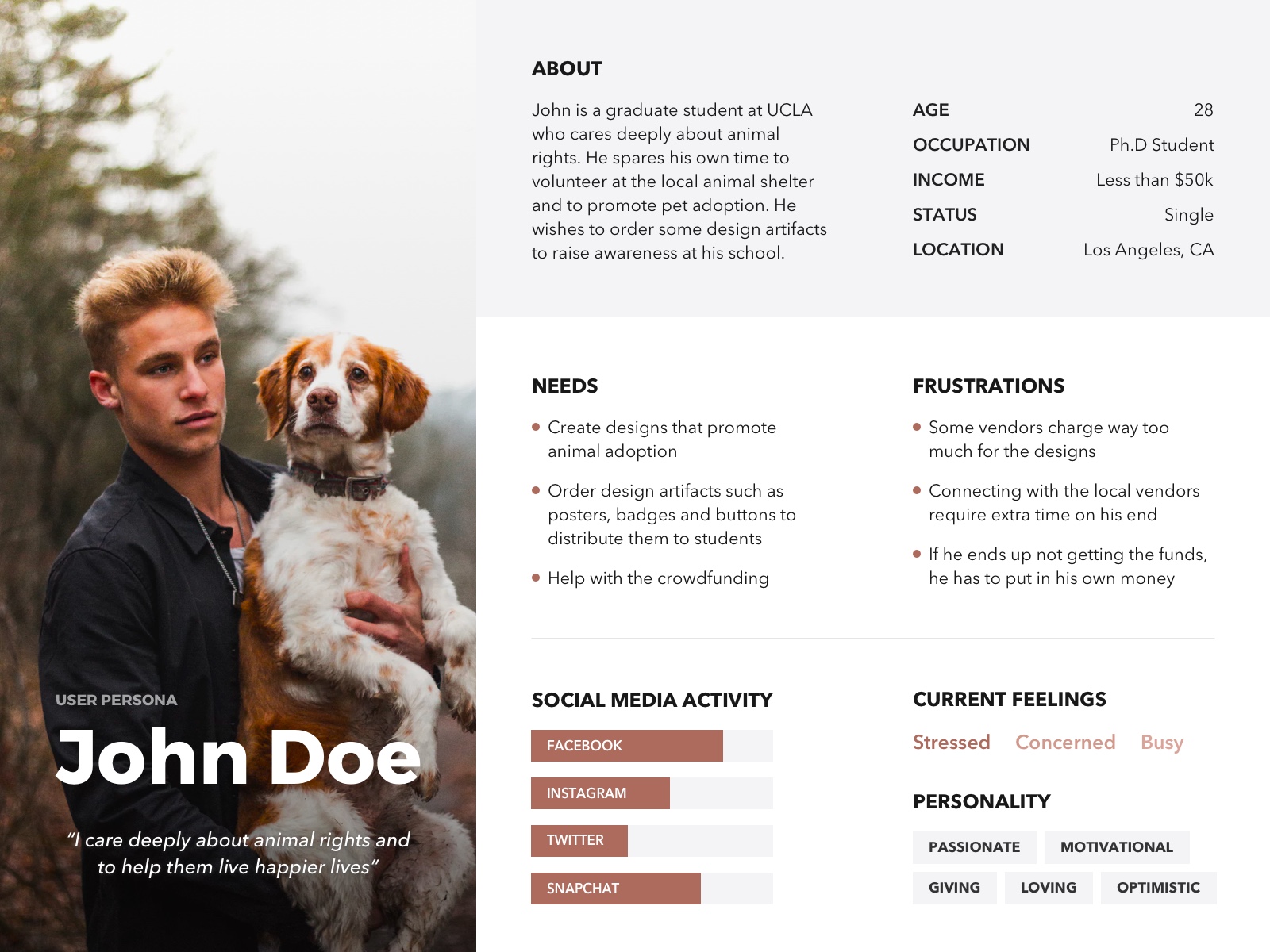
Generally speaking, the more specific your user persona guide is, the better. Take a look at the previous tip to see a few of those concrete factors. However, other sections or factors are better defined if there is a little more gray area.
Like in this example, where personality traits are more accurate if they are graded on a scale. It is better to say that Rory is a bit more introverted than extroverted. Labeling him at either extreme would paint an inaccurate picture.

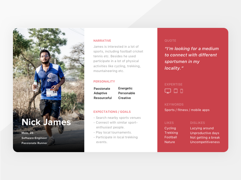
17. Assign each user persona example a real name.
Thinking about these personas as actual customers or people can make the whole process of developing personas more effective. That is why I believe that assigning them a real name is so essential.
Take a look at this user persona example, if they had used a single keyword or something like “Runner McGee” the facade is broken immediately.
Then you run the risk of your user persona guide being just another document that your team ignores. Your personas should guide your marketing plan.
18. Break down a day in the life of your user persona.
To help think like your persona, it can be helpful to imagine what a day in their life is like. An easy way to illustrate a daily or weekly routine is by using a timeline infographic. You can use icons to illustrate the different activities they do or obstacles they face.
Like Monica Miller did in the user persona example below, you can impart a lot of information in a rather small package.

19. Present all personas guides on one page for easy comparison.
Comparing the similarities and differences between your personas can be helpful when creating your marketing plan. You can make comparison easy by showing your personas on one comparison sheet (or even a comparison infographic).
In this user persona example, they presented all three personas on one graphic. You can compare each aspect in a matter of milliseconds, instead of swapping screens or shuffling papers.

20. Summarize each user persona with a few keywords.
What drives each of your user personas? Try and summarize them in a few powerful keywords.
These user persona examples come from our friends at Mailchimp. I can confidently say they are my favorite in this roundup.
Not only are they visually unique and can be used as posters around the office, these guides also tell you all you need to know about each persona with only a few keywords.

21. Highlight social media or tech use.
The social media platform or technology a persona uses on a daily basis should definitely be included in each guide. This tip — and user persona example — is especially useful for any brand or company that is internet-based. Not knowing both of those factors could spell trouble from the beginning, because if we were to target one of these personas on the wrong device or platform, all our efforts would be a waste.
So, take the time to really find out where your personas are hanging out, and what device they use to do that.

22. Never use recognizable faces or celebrity photos.
I mentioned already that you should give each persona a real name, and the same can be said when it comes to using images or headshots.
Creating the impression that this is a real person is key, so do not use any celebrities, people from your office, or recognizable faces. This could lead to people subconsciously adding traits from these people to the personas.
In this user persona example, they did the right thing and used a random person. It is almost like you are looking at a blank slate, which really is ideal.

Now that you know how to create an ideal user persona, it’s time to actually go do it! These are going to take a while, and involve a lot of research but do not get discouraged. In the end, they will be worth it because you will be able to help your customers better. When in doubt, start with a persona guide template.
Ryan McCready is the Content Editor and Design Analyst for Venngage. He graduated from the University of Arkansas with a degree in economics and international business.


